There is a word the global luxury industry has been using for three years that has finally reached Indian residential design, and the honest thing to say about it is that it was overdue. The word is "quiet." Quiet luxury, in the garment context, is the suit that does not have a visible logo. Quiet luxury, in the residential context, is the home that does not have a visible effort. Both are responses to the same cultural exhaustion with ostentation. Both are notoriously hard to photograph, which is part of what makes them desirable. And both are, for the first time in a serious way, becoming the default brief for the 2026 Indian luxury buyer.
This essay is a reading of that shift, and of what it asks residential architecture and interior design to do differently. Forbes Fab Luxe Residences is the reference because its design grammar — visible in the drawings, the material palette, the amenity mix and the marketing language — reads as the clearest quiet-luxury Indian residential product launched in the current cycle.
What the buyer is leaving behind
The Indian luxury home market of 2010-2020 was defined by a specific aesthetic: large chandeliers, high-polish marble, heavily veined stone, gold-toned metal, dark wood laminates, massive crystal showroom-style fixtures, and a preference for "grand" over "restful." The home was a statement. The statement was wealth. The volume, literally, was high.
The 2026 buyer has grown up on Instagram, has travelled to Scandinavia and Japan, has stayed at hotels by Aman and Six Senses, and has internalised a different aesthetic. Calmer palettes. Matte rather than gloss. Timber rather than laminate. Natural stone allowed to show its flaws. Fixtures with smaller visual footprints. Less chandelier, more lamp. Less feature wall, more empty wall. The home is a refuge. The refuge whispers.
The five signals of quiet luxury in a residential interior
Material honesty. Stone is specified with natural veining rather than manufactured veining. Timber shows its grain and its knots rather than being painted or laminated. Metal is brushed or patinated rather than chrome-plated. Plaster is hand-finished rather than spray-applied and glossed. The material tells the truth about what it is.
Restraint in finish. The number of distinct finishes per room is low. A living room in a quiet-luxury home has perhaps four material palettes — stone on floor, timber on joinery, linen on upholstery, plaster on walls. A living room in the previous generation's luxury grammar has twelve — with three different stones, two timbers, a mirror wall, a feature wall, a metallic ceiling, and so on. The eye, in a quiet-luxury room, has less to track.
Warm, low light. Our essay on the psychology of light takes this further, but the short signal is that a quiet-luxury home is lit at 2700K rather than 6500K, and is lit from many small sources rather than one large fixture. The room dims gracefully into evening rather than staying fluorescently bright.
Considered proportion. Furniture is sized correctly for the room, not one size larger. Ceiling heights are generous but not cartoonish. Doorways are tall. Windows are large. The proportions feel resolved rather than compensatory.
The absence of visible branding. No designer logos on fixtures. No manufacturer names on knobs. No crystal waterfall in the foyer. The quality is visible in the weight of the materials and the precision of the joinery. The brand, if there is one, is invisible.
Reading Fab Luxe through this lens
Forbes Fab Luxe Residences reads as a quiet-luxury project from its material palette upward.
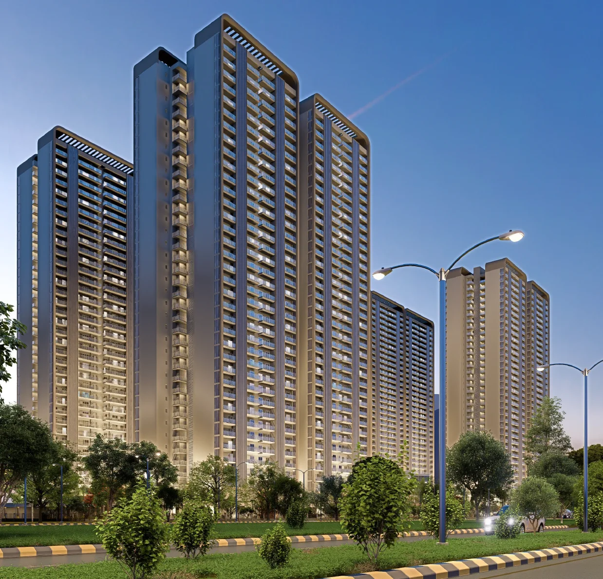
The specification for the 3 BHK + Study at 2,690 sq ft and the 4 BHK + Study at 3,307 sq ft emphasises natural stone with visible grain rather than polished-to-glossy marble, timber veneers in warm mid-tones rather than dark laminates, matte fittings rather than chrome, and linen and cotton-toned fabrics rather than the heavier jewel tones that dominated the previous luxury cycle. The balcony finishes are understated — stone coping, timber slats, planters in natural terracotta tones. The lobby finishes are stone and timber, with lighting from coves rather than chandeliers.
The amenity programme follows the same logic. The gym is equipment-forward and material-quiet. The spa reads closer to Aman than to a mall health club. The library is wood-panelled and low-lit. The café is small, warm, and restrained. The landscape is oxygen-park-forward rather than ornamental-fountain-forward. This is not an accidental aesthetic. It is a cohesive design brief that reads quiet luxury end to end.
Quiet luxury is expensive
A myth worth addressing directly: the quiet-luxury look is not a cost-saving design decision. It is the opposite. The bare plaster wall that looks right is harder to execute than the feature wall that hides its flaws. The single slab of stone is more expensive than the tiled-and-grouted floor. The concealed lighting detail is more expensive than the ceiling pendant. The empty space is, quite literally, the most expensive space in the home, because it is space that does not earn its cost through visible feature.
Buyers who have understood this are the buyers driving the quiet-luxury cohort. They are paying, effectively, for restraint. The developer who can deliver restraint at scale — which requires design discipline, procurement discipline, and the willingness to argue with subcontractors who want to add one more detail — is the developer who earns the premium. At Fab Luxe, the signals that this discipline exists are in the drawings and the specifications. The execution will be visible from December 2028.
The acoustic dimension of quiet
Our acoustic privacy essay makes the explicit case, but it bears repeating here. Quiet luxury, literally, requires quiet. A home that looks like Aman and sounds like a cricket stadium is a home whose aesthetic is undermined by its engineering. The UPVC insulated windows, the narrow floor plates, the low-noise fresh-air systems at Fab Luxe are, in this sense, part of the quiet-luxury brief. The material palette and the acoustic palette are the same conversation.
The colour question
One specific shift worth naming: the quiet-luxury residential palette has largely abandoned the jewel-tone accent walls — deep emerald, burgundy, navy — that dominated the previous luxury cycle. In their place: off-whites, warm greiges, soft taupes, chalky blacks, muted sages. The palette is narrower, more confident, and harder to get wrong. A small colour mistake in a jewel-tone room is a small mistake. The same mistake in a quiet room is disastrous. The developer who can colour-specify a quiet palette correctly is the developer who understands the game.
Biophilia as quiet luxury
The biophilic design argument is a close cousin to the quiet-luxury argument. Both read as responses to the same cultural exhaustion. Both emphasise natural materials, visible imperfection, calm palettes, and restraint. A serious quiet-luxury residential project is almost always also a serious biophilic project. At Fab Luxe, the thirteen-acre landscape, the deep balconies sized for real plants, and the oxygen-park amenities are all, in effect, biophilic-quiet gestures.
What buyers should ask on a site visit
When evaluating a residential project on its quiet-luxury seriousness, the useful questions are material rather than rhetorical. What is the stone spec — is it genuine natural stone or engineered? What is the timber spec — is it veneer, solid, or laminate? What is the metal finish — is it brushed, PVD-coated, or chrome? What is the plaster finish — is it hand-applied or sprayed? What is the lighting colour temperature in the bedroom? Is the chandelier a leftover from an earlier brief, or is it absent from the plan entirely? Is the feature wall present, and if so, why?
At Fab Luxe, the answers resolve in the quiet direction. Natural stone. Timber veneer from quality mills. Brushed and matte metal finishes. Hand-finished plaster. Warm bedroom lighting. No chandelier in the standard brief. No feature walls for their own sake. This is quiet-luxury design not as marketing but as specification.
The test of a quiet-luxury home
The test, ten years in, is whether the home still reads correctly. A loud-luxury home dates quickly — the feature wall looks tired, the chandelier looks kitsch, the jewel tones look like a specific decade. A quiet-luxury home ages gracefully. The stone deepens in colour rather than looking worn. The timber patinas. The plaster develops a lived-in texture. The empty space fills, slowly, with the resident's own life.
This is the long game. Forbes Fab Luxe Residences is being built for it. The design brief is calibrated for a home that will look correct in 2038, not just in 2028. That is the definition of luxury that makes quiet luxury worth the premium. For the complete reading of the project, the cover essay is the reference. The short version: the new Indian buyer is saying less, and the serious developers are finally listening.
A closing detail
One final signal, small and reliable. Look at the door hardware. Quiet-luxury residential design specifies door handles, hinges and latches with weight and finish that read correctly in the hand before they read correctly in the eye. A handle that feels substantial, that pushes the door open with a single precise motion, that closes with a soft metallic click — this is the kind of detail the resident touches ten thousand times over the life of the home. A handle that rattles, wobbles or tarnishes within a year is a detail that silently erodes the home's luxury reading, no matter how correct the marble is. At Fab Luxe, the hardware spec is the quietest line on the list and one of the more telling. It has been chosen with care.